Treat Your Business to a New Commercial Interior Design This Year in the Bergen County, NJ Area
Revamping your Bergen County, NJ Area commercial interior and achieving a cohesive, fresh look that reflects your brand can breathe new life into your spaces. Enlisting a talented design-build company can deliver exactly what you need to create an engaging environment. Here are some recommendations they might have when designing a new commercial interior.
There are seven general principles a commercial design-build company considers when renovating a space. When you understand the principles, their approach to delivering the commercial space you need can make sense.
Design Principle #1: The available space determines the whole design plan. This includes the two-dimensional space of the floor space that forms the bones of the design. It also includes the three-dimensional space that makes up the walls, ceilings, and open areas in between. Their goal is to keep the entire space in balance with no crowding.
Design Principle #2: The second principle is the forms that fill the space. A commercial designer must account for open spaces where the interior is visible to anyone and closed spaces that shield the occupants from view. The right shapes balance a space and create a unified form.
Design Principle #3: The third principle is the lines, both horizontal and vertical lines. As they assess a commercial space, their goal is to maximize your horizontal lines which are furniture and other items that sit on the floor, and vertical lines like windows and doors.
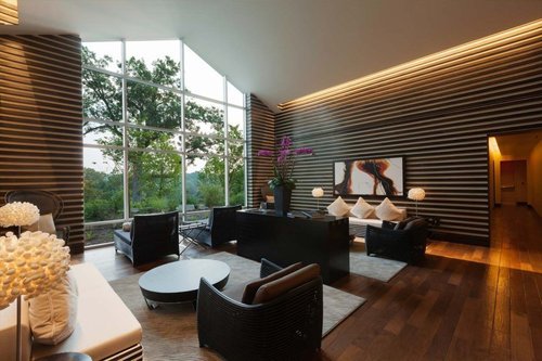
Design Principle #4: The fifth principle is light. Light can be a crucial component of a successful commercial space. The first priority is to allow as much natural light as possible into the space as this improves the mood of the employees who work there. Ample natural light can promote more productivity and improve the efficiency with which people work so a commercial designer will utilize all the natural light possible. The second light type is task and mood lighting which involves light fixtures in multiple sizes, shapes, and positions.
Design Principle #5: Color is key to reflect your company’s brand and image. Another important detail about color is the soothing or energetic effects it can have. A commercial designer will want to incorporate colors that are distinctive to your brand and logo while balancing them with tones that are calming in certain places like the lunch area and a sitting area.
Design Principle #6: Texture can be an important addition to a commercial design. Using textures in innovative ways can take a space with monochromatic colors and transform it into an area full of visual interest. You can touch textures in pillows and fabrics for curtains and you can see textures in art and paintings, ceiling tiles, and other details that make an interior commercial space engaging.
Design Principle #7: Patterns are the final design principle that makes a big difference in how employees and customers perceive your space. Patterns like the varied tones of wood grain on the floor and custom light fixtures mimic the shapes of other parts of the space and design.
Finally, a commercial design-build company can work within the parameters the building and town require to create interior spaces that are accessible and attractive with functional areas for any work needs.
Related: A Look at the Process of Constructing a Custom Office Design in the Brooklyn and Queens, NY, Area

